| |
|
The final mission of Space Shuttle Endeavour: STS-134
...
the speed of Gods ...
Time counts not, though with swiftest minutes wing'd.
– Paradise Lost
To see pictures from the April 29th attempt, and the
successful launch on May 16th, click on the image (left). |
Two weeks ago, following the unsuccessful launch attempt on April 29th, the minutes didn't seem quite so "wing'd." Tentative launch dates were rescheduled immediately: First to May 2nd, then to the 8th, and 10th, and finally to May 16th. I spent a week south of the border around the time of the Endeavour's first launch attempt but happily, after three days back home, I was able to return when that last date firmed up and my transportation out to the viewing site (inside the space center complex) was confirmed. This time, with the exception of a last minute tile repair, all went according to plan.
The pictures in my own album will certainly tell the story, but I was more interested in capturing the atmosphere of the event rather than taking "the best picture ever" – as always, there were plenty of photographers in attendance trying to do just that, and there are many amazing photos online. Of course video is the next best thing to actually being there, so I've included links to a few video clips as well, which present the moment far more effectively than I ever could with just words and still picture:
Official NASA video: http://www.youtube.com/watch?v=0YBWaFIs1Rc
Youtube video taken from the NASA Causeway: http://www.youtube.com/watch?v=q3FN8m-sZ0g
STS-132, same perspective, but on a clear day: http://www.youtube.com/watch?v=ESk0mFt_-E4
To see pictures from the last night launch, STS-131, see the "Photography" page. |

My March update was sent out in order to coincide with TVOs current affairs program, Agenda, specifically to address the episode entitled Who Needs Art?, which aired on March 11th 2011. The following is a commentary of my own, based on that same program. |
When I made mention of TVO's upcoming Agenda program in my update of March 10th, I had no knowledge of the program's contents (beyond those implied in the title of course) and if you tuned in to watch that episode, it will have occurred to you that painting, as an art form itself, was not actually mentioned. Naturally, this begs the question: Why?
The five guests selected represented various disciplines and institutions: The National Ballet School, The Stratford Shakespeare Festival, The Royal Conservatory of Music, Ryerson University faculty of Communication and Design and The Toronto Arts Council. I should be pointed out (since it won't be immediately obvious) that the last two guests, contrary to expectations, also specialized in theater, music and opera – having degrees and direct experience in these areas. My feeling is that the focus on stage is a direct consequence of “performance art” being front and center on the contemporary art scene, for the time being at least. Naturally, given the nature of theater, and other similar institutions, the main questions were about funding and the constant need to reach new audiences.
The entire broadcast can be downloaded at:
http://www.tvo.org/cfmx/tvoorg/theagenda/index.cfm?page_id=741 The purpose of my own commentary though, given the conspicuous absence of the visual arts in this discussion, is to explain the reasons I believe it was omitted. The title of this piece, Art in a Wal-Mart World, goes only part of the way in explaining why painting was not one of panel's discussion items. The 'Wal-Martization' of art is more a symptom than a cause, however, and an inevitable consequence of a hundred years of artistic deconstruction. Thus, we need to look back.
Before I elaborate, it must be said that I am completely enamored with Modernism. The art and the ideas, all of it, up until about 1940 that is, after which point it seems that everything there was to say had already been said. Modernism continued to evolve of course, as is its nature, though I cannot muster much enthusiasm for its later incarnations. Post-Modernism makes no excuses for its appropriation, recombining and repackaging of preexisting material, but I always smile when I think of a comment made by the renown designer Massimo Vignelli, when he speaks of the “disease called Post-Modernism.”* My own feelings are not quite so strong, but I do understand his vehemence.
How minimalism and deconstruction lead to the marginalization of painting, and the Wal-Martization of art, is a long and convoluted journey. In a world where the traditional image has been stripped of all its original values, completely deconstructed and then cast aside in favor of found objects, installations, and, eventually, performance art, what is left? The answer: Decorator art. Popular culture has reduced flat art to not much more than expensive wallcovering. If the art has nothing to say, if the artist has nothing to say, then art is just a commodity like any other. If this is the case, Chinese factories can manufacture 'product' much more efficiently than any artist...and will. >>> CONTINUE READING
|

Previous Update
With the first three months of 2011 being such a rush, the last update was limited to just eight short stories, background to eight of the ten paintings that hang on the walls of my own home. As mentioned in the last update, after 22 years of painting, only twenty some paintings remain unsold (That number changes constantly of course - "Rush hour in Resolute" and "The Construct" both sold quite recently). Other available works can be seen at Loch Gallery in Toronto, and, if you follow the links below, I'm sure you'll enjoy the paintings from my own collection. There are additional photographs on each of these pages, so please enjoy, "The paintings that never left home!"
|
 |
I am happy to say, the painitng Mercantile (which has been posted on the index page of my site for some time now) was recently added to another directory of Photorealist painters – under the heading: "Astonishing Photorealistic Paintings." This is flattering, of course, since I really only consider myself a "representational" or "realist" painter. Though I feel rather like the odd one out on this page (as you will see) the thing that grabbed was the commentary on realism that accompanied the works selected.
I must say though the cityscape images I have been creating in recent years are "recreations." In the way that photographer Jeff Wall creates his images, they are "Staged," except that many of the elements of my compositions are not from photographic reference at all – they only appear that way.
One of the most irksome comments that realist and photorealists receive is: "why not just take a picture?" Once I've nodded, and smiled politely, I go usually go on to explain that photographers, and realist painters alike, choose to present a given image for a very specific reason. And the fact that a painter is willing to spend many, many hours in creating an image, should say something to the viewer.
In the world today, we are inundated with snap shots beyond number and computer enhanced images designed specifically, by advertising agencies and special effects companies, to wow. In the resulting Melee of visual stimulus, subtle images are easily overlooked. As digital cameras have proliferated, along with the technology to share pictures, there is the additional phenomenon of image overloaded. The sheer volume imagery eventually causes the eyes, in effect, to glaze over – until something 'loud' enough, shocking enough or strange enough jumps out. If enough pictures are taken, it is inevitable that something will. But, just because something gets noticed, it is not, in itself, a validation – though proponents of modernist art theory (From Impressionism to Fluxus) will be pleased that the "accidental" has now, truly, come into it's own.
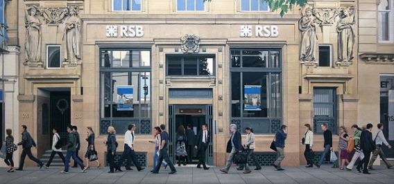
Mercantile, the painting that "Insfyre'' picked up, on the surface at least, seems much like a number of my other "Walking Man" pieces, and conveys a sense of restless activity ... Continues below >>> |
 |
Mercantile - Acrylic on Canvas - 14½" x 30"- 2010 |
The hustle and bustle of city life. In actuality, this painting was created as a commentary on recent events in the financial world. The fallout from which has touched us all in one way or another.
If you have been to the U.K. you will likely notice the signage over the window in this painting is not quite what you might have expected. I thought it best to not mention the bank by name (though none of this is a secret of course) and the lettering too has been suitably rearranged. The revised logo, however, was recreated with deliberate intention. An effective, and immediately recognizable corporate signature, the inward point arrows of this important banking institution are remarkably reassuring. As you will see here though, I have reinterpreted a little, and the arrows in this logo are directed outward, mimicking another, perhaps not-so recognizable, symbol: Chaos.
"Things fall apart; the center cannot hold.” Is an idea that cannot be separated for the symbolism of "The Chaos wheel," and these immortal lines, by Yeats, have seldom being so appropriate. When the entire central banking system seemed about to unravel, the civilized world held its breath. Being from the UK, and because I travel there regularly, I still maintain a bank account at "RSB." So it was particularly upsetting when the recent financial upheaval saw the bank's stock drop by 40% in a single day. Thankfully, the British Government stepped in to stop a run; although, since then, the Pound Sterling has slowly devalued (Against the Canadian Dollar at least).
The title of this painting, despite the immediate connotation (Mercantilism), is a reference to Mercury, the Roman God of commerce and the root of this word – As symbolized by the caducei carved above the door and window. In addition to being a messenger of the gods Mercury is also a Trickster and, through his association with trickery, and ancient elemental forces of course, he is inextricably, connected with the idea of chaos...and so the narrative ties together.
Much remains to be said about this enigmatic and most paradoxical of subjects, but that will have to wait until later...
|
Past updates, some of which were located at the bottom of this page, have now been moved to a new location. Links to all of the updates from the past five years will be added soon. >>> Previous Updates |
Many of the images in the two new "Portfolio" galleries – "Trickster" and "Collection" – will appear the book The Journey and the Painter's Muse ( below) and the French River and Killarney pictures , mentioned in the last update, must wait until next time, as I've not yet sorted though my Sept and Oct Images. Nevertheless, I'm working hard to get on top of things and, when we are deep into those cold, dark days of the early new year, you may enjoy a reminder of autumn 2009 - and what lies in store potentially, for summer, 2010. |
 May Update
Art in a Wal-Mart World ... Continued
This realization came to me last year when I was camping with my family in Killarney. I had bought a copy of the Toronto Star en route, first to read, and then to start campfires. In one section, New In Homes & Condos was a piece by the popular designers Colin and Justin. They were doing there usual thing of course, advising on trendy home décor options, and, under the heading “ARTWORK,” they suggested that box stores, including Ikea and Home Depot, even your local supermarket, can provide the perfect finishing touches for any room. It is very true that you don't need to spend a lot of money on art. I haven't participated in the big art festival shows for a long time now, but I thought it was an important commentary on the times that even art is now being outsourced. Local artists, at the TOAE, Artists Project, and other such group exhibitions, are feeling the pinch as a result. This was a watershed moment. After fifty years of indoctrination by an art establishment that has been systematically dismantling art, it is time for individual artists to again find their voices, and make a case for the relevance of their work in the modern world.
The only reference to painting that might be inferred from the Agenda program was in a video clip of the American 'artist,' Hennessy Youngman, who proposed, at some length, the idea that "talent" was no longer essential when creating art.
View video: http://www.youtube.com/user/HennesyYoungman#p/u/5/vVFasyCvEOg
I thought this was an interesting aside – though a piece of 'performance art' itself – as I made a passing mention in my previous update to the Fluxus movement. The essential principle of which (and I hate to take the wind out of Hennessy's sails) is that 'practiced' art – anything premeditated or done with intention, training and skill – is not real art. It is craft.
See The Fluxus manifesto: http://www.artnotart.com/fluxus/gmaciunas-manifesto.html
When I visited the Tate Modern in 2008, I was 'fortunate' to actually witness a Fluxus "happening." Alongside a performance of atonal “noise” music (presented with great earnestness by a small otherwise classical ensemble) was an interactive demonstration in which visitors were encouraged to participate. The 'piece' consisted of ping-pong tables where visitors could improvise games using a wide assortment of fresh fruit and vegetables, instead of paddles. The interactions that occur spontaneously and the unintentional consequences of this process – to a Fluxus adherent at least - represents pure art.
The idea of questioning the definition of art itself is something that began with Marcel Duchamp in 1917 when he displayed the piece entitled Fountain, a urinal with a few letters scrawled on it. Sadly, this questioning seems to have become a preoccupation, and art has continued to gaze inward at itself, though Fluxus was only a short-lived phenomenon. Duchamp, after a long and controversial career, was one of the key members of the original Fluxus experiment, but quickly moved on to other things. The concept that someone completely untrained and “unskilled,” in what ever the medium at hand happens to be, can create pure art, is essential self defeating, and it is no wonder this movement is not among the more well-known in art history. Immediately on the heels Abstract Expressionism, Fluxus 'painted' conventional art into a corner (ideologically speaking). But, from this conceptual experiment, three key ideas moved into the fore: the accidental, art as an interactive process, and art as performance. We have been living with the consequences ever since.
For many years, painting has been considered an 'out-moded' form of expression (see my 2006 update: http://www.wdavidward.com/currently9.htm#item4). Since the 60s, installation art has been all the rage, and it is still very popular, more recently though, performance art has become the most lauded form of expression. I wrote about this in an earlier update when the Turner prize in London was awarded to a performance piece, which consisted of a man in a bear suit wandering around an empty art gallery in Berlin (which is an ironic commentary in itself). To further illustrate this point, MoMA recently hosted a very interesting art performance (March 2010) where an artist sat for hours at a time staring blankly across an empty table. Visitors were invited to sit across for her, and stare back. Little happened of course, and what did happen was largely a result of those who chose to participate. (Art has to be interactive now, don't forget.) The occasional giggle or a teary eye seems to have been the extent of it, but you can watch for yourself:
View video:
http://www.moma.org/explore/inside_out/2010/03/15/live-streaming-marina-abramovic-crazy-or-brave/
I say this piece was interesting because it illustrates a fascinating continuation of the deconstructivist bent of contemporary art. That penchant for minimalism has now even managed to strip the performance out of “performance” art.
On the MoMA website, ninety-three years after Duchamp's urinal, the question 'Is this art?' is still being asked. Perhaps it is time to concede that we might never know what art is, really. We do know however, and instictively, when something speaks to us. So maybe the question we should be asking now is: What does it actually have to say?
* Helvetica, 2007. Documentary Film by director Gary Hustwit. |

 |
|
 |
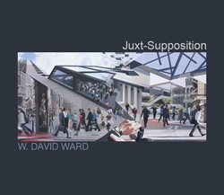
The catalogue for my 2009 solo exhibition is a 40 page hard cover book which explores the core theme of my work, an idea that has developed gradually over the past 10 years. Juxt-Supposition is limited to just 33 copies, the last few however accompany paintings from this exhibition. A copy can be seen at Loch Gallery in Toronto, please feel free to drop by. New works will be delivered in May. |
|
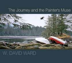
Currently in production. This publication will be an 80 to 120 page hardcover book covering the past 25 years of my art and travels. It will include material from various trips and exhibitions, approximately 80 of my favourite paintings, along with anecdotes and a rather quirky look at the idea of inspiration itself.
The Journey and the Painter's Muse (Draft cover) will be available later this year - Inquires. |
|